I stumbled onto the google test list tonight and noticed a new preview feature in search. It works really well and takes good advantage of the excess white space on their search page. A nice bonus is the non forced nature of it. If you mouse over any of the results nothing happens unless you click on one of the magnifying glasses. The full length preview of the page immediately comes up (way quicker than I have ever seen on other search engines) and since its the full page scrolled you can read and browse it quite thoroughly. After the first magnifying glass is selected, subsequent search results show the preview by simply putting the mouse over it. Also if you scroll the preview does not flicker through mouse over events so you can browse the full preview. When you stop scrolling and mouse over a new result it then switches. Overall feel was great and I hope they roll this out.
Tag: Design
Re-Hashing your reading experience. (Tablet Concepts/MacBook Touch)
Now that tablet PCs are not just “coulds” but are “soons,” designers must start to really reinvent the way the rest of us will digest content. Non laptop touch interactive computers are coming soon, probably the first jaw dropper in late January. So what will this new world be like?
Berg, a design company in London, tasked themselves with creating a video that describes this new reading environment. How you will read content, scroll through content, orientation, spacing, interaction, etc. must all be well thought out to keep the reader immersed in the content while allowing the great new tools a tablet can offer to become exposed and, well, at your fingertips — ready to go.
Below is a video of Sports Illustreted demo’ing their newest SI release on the Apple MacBook Touch
And then another tablet video for the Courier from MicroSoft
Balsamiq, an interesting taste of things

Balsamiq.com is a web application (that also comes in a downloadable software version) that allows users to quickly create mockups for web sites and iphone products. I was skeptical at first, but 2 things made me pretty happy with thier approach to this common problem.

The first was the choice they made to exagerate the concept of fuction over form. Their toolset, or stencils are purposly quasi-poorly hand drawn graphics that have a major lack of attention to detail. As the owners of Balsamiq.com put it, “it encourages critisism” … “so that people don’t get attached to ‘that pretty color gradient'”. The secod thing I liked after playing around with the app a bit was the way they decided to implement the editing process of these draft like stencils. Most implemetations of design toold have properties panels that allow you to change many aspects of a feature, but not only do those properties get complex but since you are given many properties you try to use them in various combinations and often times doing so has unwanted results i.e. certain border style doesnt work well with large boxes with italic text.

At balsamiq.com the stencils are all pre fab and standard, not much is expected of them other then being better then just a place holder. Content is, for the most part, the only thing you can change and they use a simple text edit box when that content needs to be changed. When you double click a stensil the data is presented in a markdow laguage. i.e. buttons that are hard to align and choose width and colors are nothing more then a comma delimited list in edit mode — (button 1, two, and three). When you click of the text box the buttons are created for you.
They truly stuck to the motto of just use the bare essentials and KISS paradigms to set the expctations of the designers and reviews while making the process of creating dead simple. Which in the end created a great mockup tool, allowig you to focus on what you shoud be focusing on ayways — workflow and content placements.
Give it a try @ http://balsamiq.com/demos/mockups/Mockups.html
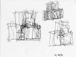
Gehry Up

Sketches of Frank Gehry (2005)
Just saw a pretty cool documentry called Sketches of Frank Gehry. Frank gehry is and artist/ architect that is probably most known for his Disney concert hall or the the Guggenheim in Spain. The docuemntry exposes a man who cares nothing fro conformity and captures the essance of entrepenuership. He quits his job as an architect as as he puts it “he has nnever been hapier”
Check out a trailer here or more on imdb here


Through the (cable) wire
![]()
I am a Kanye West music fan, and I am not afraid to admit that I can love his music. I appreciate his message but I do so for example the same way one appreciates the lady in the next cubicle, who annoys the hell out of you, tells your jerk of a boss off in front of everyone. It’s intensly awkward, and your jaw drops open in amazementat the audacity of the action. In the back of your mind you may think however, ”way to go, you sure did stick it to him!’ — but you would rather not associate with them moving forward.
Anyways I came across his blog not to long ago (http://www.kanyeuniversecity.com/blog/) and find that it churns out some great fasion, style, and songs. So I figured I would share the link and some of the posts with you, you can decide what to do with it for yourself.

Music
Great Jam with harpsichords and a tight beat:
http://www.kanyeuniversecity.com/blog/?em3106=235082_-1__0_~0_-1_5_2008_0_0&em3161=&em3281=

Design
Cool looking interior designs:

Art
Cool Art work:

Videos:
And Interesting Videos:
http://www.kanyeuniversecity.com/blog/?em3106=234763_-1__0_~0_-1_5_2008_0_0&em3161=&em3281=
